What's Fusuma?
Fusuma is a tool to create slides easily for you.✍ ️
- Powerful CLI
- Providing mdx and custom themes
- Presenter mode
- Exporting as PDF
- Improving SEO/OGP
just code only Markdown and execute with CLI😍
Procedure
$ npm i fusuma -D
$ npx fusuma init
$ tree -a
.
├── .fusumarc.yml
├── .github
│   └── workflows
│       └── fusuma.yml
├── slides
│   └── 0-slide.md
└── style.css

# --- executable tasks---
$ npx fusuma init          # create scaffold
$ npx fusuma start         # run server for development
$ npx fusuma start-prod    # run server for bundle directory
$ npx fusuma build         # build slides for production
$ npx fusuma deploy        # deploy to github pages
$ npx fusuma pdf           # export as PDF
// package.json

{
  "scripts": {
    "start": "fusuma start",
    "start:prod": "npm run build && fusuma start-prod",
    "build": "fusuma build",
    "deploy": "npm run build && fusuma deploy",
    "pdf": "npm run build && fusuma pdf"
  }
}
Syntaxes Provided by Fusuma
Basically, you don't have to code js and css so you can focus on coding Markdown to create your slide.
Fusuma provides some features using HTML comments.
Splitting Slides
## Hello

This is the first slide.

---

## ✌️

This is the second slide.
You can split slides within the same file by using --- syntax.
Adding Classes
<!-- classes: title, main -->

## Hello
.title h2 {
  color: #161d6f;
}

.main {
  background: #eae3c8;
}
These classes attach to the top level of a slide container.
Creating div tag with class name
This example uses grid classes(.grid, .column).
<!-- block-start: grid -->

  <!-- block-start: column -->

left

  <!-- block-end -->

  <!-- block-start: column -->

right

  <!-- block-end -->

<!-- block-end -->
👇
left
right
Fragments
<!-- fragments-start -->

✍

🤟

👍

<!-- fragments-end -->
✍️
🤟
👍
Setting Background
<!-- background: '../assets/background.jpeg' -->

Also, you can specify hexadecimal and names.

<!-- background: #f5f5f5 -->
<!-- background: green -->
Declaring Section Title
<!-- section-title: this is the second slide! -->

This slide has the title of a section!
👈 see the sidebar!
/* output with this class name */
.section-title {
  color: #0a043c;
  background: #a3ddcb;
}
Makes explicit declarations to create an agenda.
In addition, it is also added to sidebar's list.
Generating Agenda
## Contents

<!-- contents -->
Converts the page number and title name specified by section-title into a ToC component.
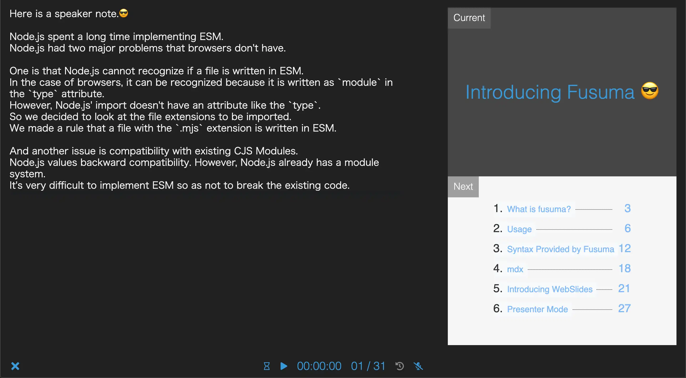
Adding Speaker Note
<!-- note
This is a speaker note!!
This sentence can be seen when using Presenter Mode.

😍
-->

## Hello!!
Displays notes for each slide in presenter mode.
Generating Links for SNS
<!-- account: twitter, about_hiroppy -->
<!-- account: github, hiroppy -->
<!-- account: facebook, yuta.hiroto0429 -->
<!-- account: linkedin, hiroppy -->
:root {
  --account-icon-size: 3rem;
  --account-icon-color: #545454;
}

/* these classes are attached */
.account-twitter,
.account-github,
.account-facebook,
.account-linkedin {
}
Executing JavaScript Code
Executes JavaScript code when the button is clicked. If you use console.log, the context will be outputted.
alert('hi!!');
console.log('hi!');
<!-- executable-code -->

\`\`\`javascript
alert('hi!!');
console.log('hi!');
\`\`\`
Generating QR Code
<!-- qr: https://github.com/hiroppy/fusuma -->
MDX
MDX is an authorable format that lets you seamlessly use JSX in your markdown documents. You can import components, like interactive charts or notifications, and export metadata. This makes writing long-form content with components a blast.
The below component is written by React and styled-components.
Hello from jsx!!
<!-- foo.mdx -->

import { Sample } from '../scripts/sample';

<Sample />
// sample.js

import React from 'react';
import styled, { keyframes } from 'styled-components';

const rotate = keyframes`
  from { transform: rotate(0deg); }
  to { transform: rotate(360deg); }
`;

const Rotate = styled.h2`
  display: inline-block;
  animation: ${rotate} 3s linear infinite;
`;

export const Sample = () => <Rotate>Hello from jsx!!</Rotate>;
Themes
Fusuma provides some themes and also you can customize them.
Presenter Mode
Recommend using this feature if you give a speech.
Fusuma is compatible with Presentation API,
but you can also use this mode if you use browsers which don't have Presentation API because Fusuma can fallback to using localstorage. Since iframes are used internally, recommend that you use this feature in your localhost.
Procedure
- Open Sidebar(click the bottom right button(三))
- Click the PC monitor icon
- If you use Chrome/Firefox, you will be able to choose select a cast device
- If you use browser that don't support Presentation API, a new window will be created
Host Screen
Speaker Note
This page is written with the following Markdown. Let's try to run the presenter mode and check the note.
<!-- note
Hi, this is a speaker note!!
-->

## Speaker Note

This page is written with the following Markdown.
Let's try to run the presenter mode and check the note.
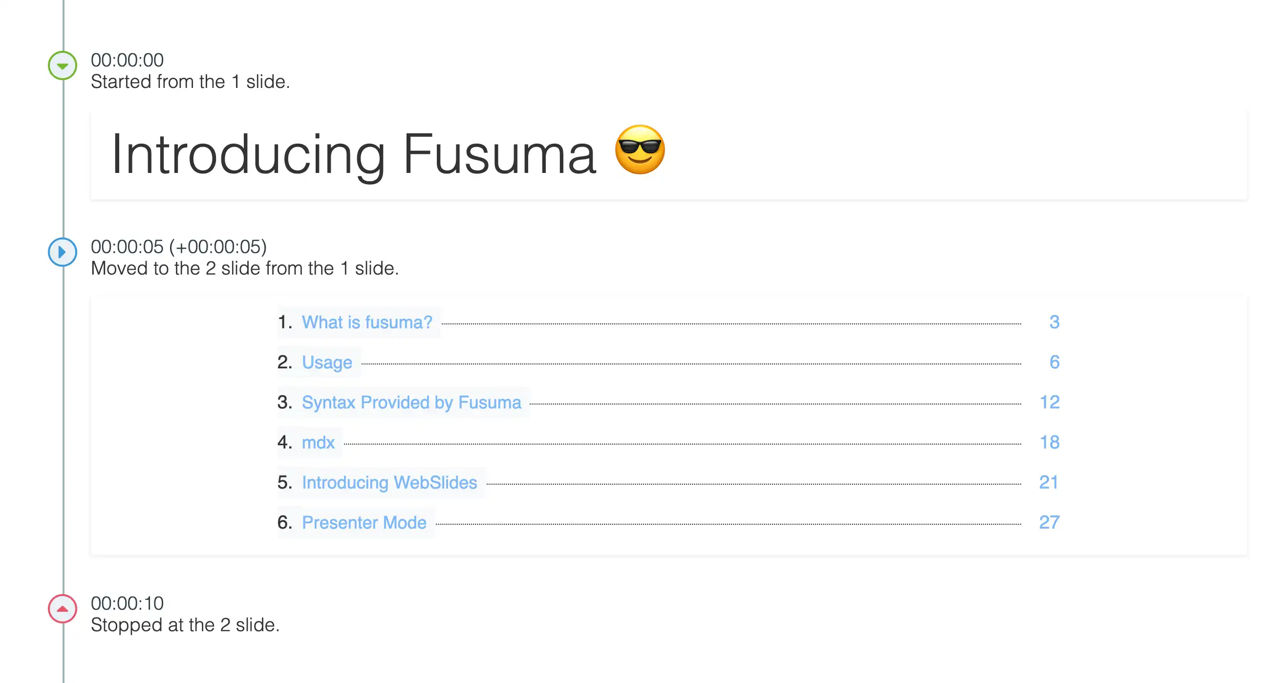
Slide Timeline and Recording Your Voice
Timeline and the recording voice are optional but these features will help you to practice making a speech.
The timeline can be time travel.
The End
Enjoy 😄
- The official site: https://hiroppy.github.io/fusuma
- The repository: https://github.com/hiroppy/fusuma
- Twitter: https://twitter.com/about_hiroppy